js+rem based mobile adaptive solution small summary
In rem
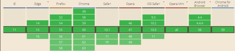
The rem is a new unit introduced by CSS3.The W3C definition of rem is that it is equal to the calculated value of the font-size on the root element. For example, when the font-size of html is 16px, 1rem=16px. It also has high compatibility, supporting browsers such as iOS Safari9.3+, Android Browser4.4+, Chrome49+, Firefox52+, IE11, etc., which meets the browser compatibility requirements of general projects.
According to the characteristics of rem, we can think of, we can use rem as a unit when setting the element’s width, height and other attributes, and use js to change the value of the root element’s html’s font-size according to the screen’s resolution, so as to realize the element’s isometric scaling relative to the screen.
Write unit conversions in less
If you need to manually calculate the rem when setting the attributes of each element, it will be very troublesome, so we can use less to write a class pxtorem
@base: 50px;
html {
    font-size: @base;
}

.pxtorem(@pro, @px) {
    @{pro}: (@px / @base) * 1rem;
}
/*较特殊的calc函数*/
.pxtoremcalc(@pro, @per, @px) {
    @{pro}: calc(~"@{per} - "(@px / @base) * 1rem);
}
invocations
.example {
    .pxtorem(width, 120px);
    .pxtorem(height, 100%, 50px);
}
Or you can also write a pxtorem function in sass. Since less does not support functions, you need to install the plugin less-plugin-functions first if you use less. See the linked readme.md for details on how to use it.
Change the font-size value of the root element with js
1
2
3
4
5
6
7
8
9
function setFont(){
    var baseWidth = 800; // 设计稿宽度
    var baseHeight = 1232; // 设计稿高度
    var htmlFont = 50; // 预设的根元素html的font-size值
    var scale = Math.min(window.innerWidth / baseWidth, window.innerHeight / baseHeight);
    document.getElementsByTagName('html')[0].style.fontSize = scale * htmlFont + 'px';
}
window.addEventListener('resize',setFont,false)
setFont();
Among them, 800px is the width of the design, and 50px is the preset font-size value of html. The reason for setting 50px is to reduce the number of decimal places, as well as to make it easier to see the value of px unit through the value of rem unit, for example, 0.12rem is 24px. After that, we judge the ratio of the screen width to the width of the draft, and take the one that has a bigger difference to be scaled. For example, if the screen width is 320, the font-size of html will be set to 320 / 800 * 50 + ‘px’, i.e. 20px.
Finally
In this solution, rem unit can be used flexibly, and px unit can be used for attributes such as font-size which do not want isometric scaling. As for images, for the problems caused by retina screen, common solutions include generating 1x, 2x, 3x images with image servers according to the device’s dpr, etc., which we won’t explore here for the time being.